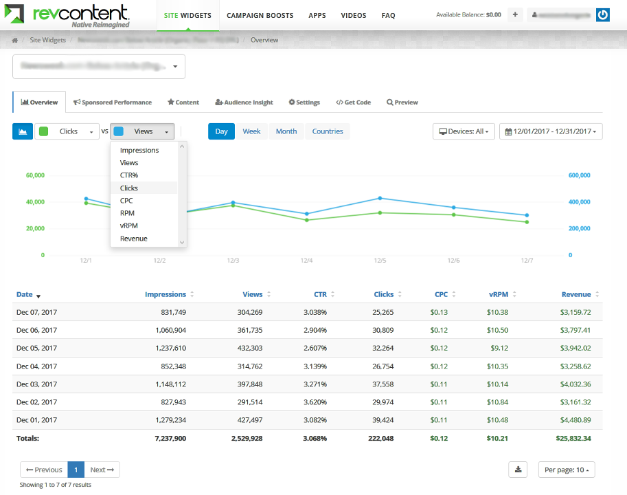
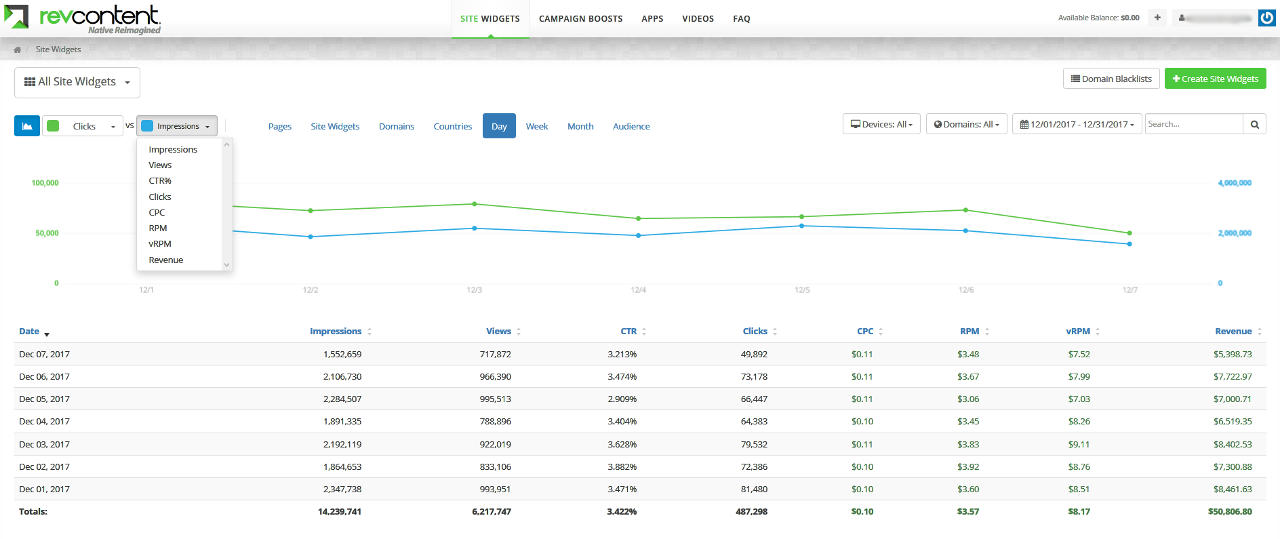
The Publisher Performance Graph allows you to view your individual widget performance or account performance by comparing any two data points against each other over any date range.
Data points include Impressions, Clicks, CTR%, Ad CPC, Ad RPM and Ad Revenue. You can also filter by device type for the most detailed reporting.
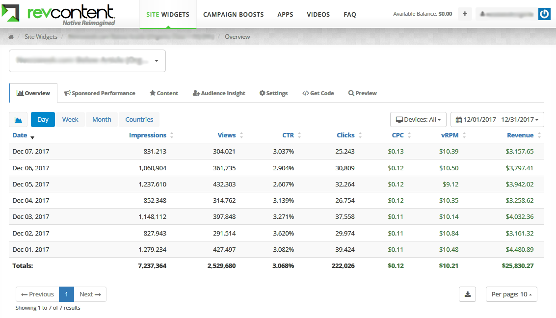
To view Widget Performance, select the graph icon.
In the Overview tab, select the graph icon to see a graph of this widget’s overall performance.
Please Note: If you are currently monetizing your email newsletters, RevContent offers additional metrics to help you better understand your performance.
Requests
Total number of ad calls generated from email opens on this day
Unique Opens
Counts one open per user per newsletter deployment, within a 24-hour window. Multiple opens by the same user for the same deployment are deduplicated
Unfiltered Clicks
All clicks recorded before IVT filters are applied
Billable Clicks
Clicks that passed IVT checks and were billed
Apple RPM
Apple Mail opens may be auto-triggered due to iOS 15 privacy changes. This separates impacted traffic from more reliable signals.
Non-Apple RPM
Revenue per 1,000 unique opens from non-Apple Mail users
Blended RPM
Average revenue per 1,000 unique opens across all clients
Compare any two data points against each other by selecting from the drop down list. Data points include Impressions, Clicks, CTR, Views, CPC, RPM, vRPM, Revenue, and more.
Both Y Axes are on either side of the graph.
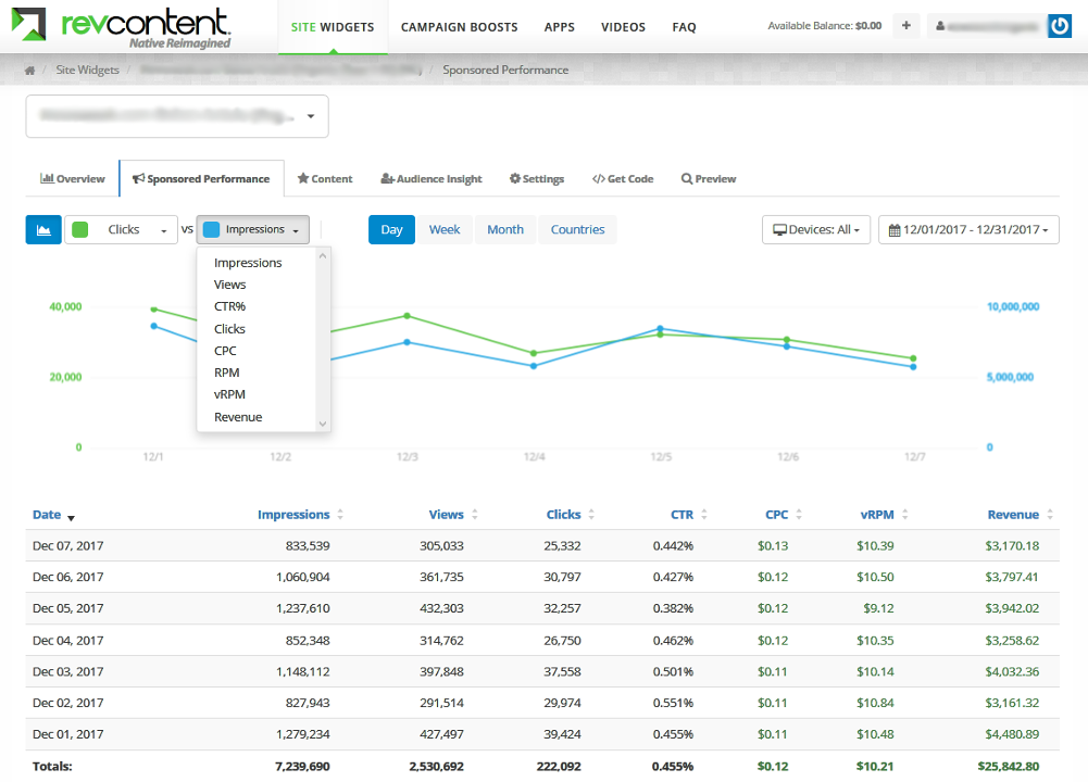
A graph of this widget’s Sponsored Performance is available under the Sponsored Performance tab.
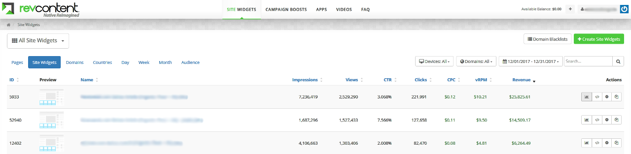
To view Account Performance, select Domains, Countries, Day, Week, Month, or Audience on your Site Widgets homepage.

Select the graph icon to see a graph of the account’s overall performance.
Did this answer your question?